Front Name/Team Typography - Font Size Variations
Written by T206museum (June 2009)
By design, front name/team typography on T206 is supposed to have players' last name all in the same font size follow
by a city with the first letter bigger than the rest of the city. Some of them also have a short form of American
or National League with the first letter bigger than the rest of the abbreviation. However, the following cards do not
follow such rule, they are simply uncorrected design error and do not carry extra premium.
Standard format in T206 front name/team typography:
LASTNAME, CITY
LASTNAME, CITY AMER.
LASTNAME, CITY NAT'L
The whole "NAT'L" abbreviation has the same small font size

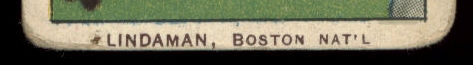
The whole "NAT'L" abbreviation has the same small font size

The "I" in the word "CITY" has the same bigger font size as the first letter "C"

The "A" in the word "MINNEAPOLIS" has the same bigger font size as the first letter "M"

The "N" in the word "BOSTON" has the same bigger font size as the first letter "B"
|